
Today is the vernal equinox. More exactly, the vernal equinox will occur about half an hour before midnight in Greenwich, England; or at about 4:30 PM PDT (my time zone). At the moment of the equinox, the sun’s position in the sky will be the origin of the coordinate system that we use to track celestial objects.
The day of the vernal equinox is somewhat special. It is one of two days of the year when the sun rises almost exactly on the eastern compass point, and sets almost exactly on the western compass point. The vernal equinox is almost exactly evenly split between light and dark.1There is some variation due to atmospheric distortion and the shape of the Earth’s orbit, but I choose to ignore those phenomena. This is also the time at which the lengths of days and nights are changing the fastest. This phrasing conjures up the study of differential calculus, which is basically the study of change and rates. However, before we get to calculus, we should probably remember a little bit of algebra, first.
One of the activities in most algebra classes will be graphing linear equations. These are equations that look like \(y=mx+b\). If you remember your algebra, the number m was called the slope of the line, while b was the y-intercept. In order to get to calculus, we are going to ignore b, and focus only on m.
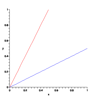
In the figure above, I have graphed two lines. The red line is the graph of the equation \(y=2x\), and the blue line is the graph of \(y={1\over 2}x\). The equations for the lines are the same except for the slope. The red line goes up from left to right faster than the blue line because it has a greater slope. In other words, we can think of the slope of a line as being the steepness of that line. If the red and blue lines represented trails up to the tops of mountains, the red line would be a much harder hike, as it is much steeper.
Another way of thinking of slope is as a rate of change. The blue and red lines could, for instance, represent the distance that a hiker has traveled from some starting point after some length of time. If we assume that the x-axis is labeled in hours, and the y-axis in miles, then the red hiker has gone 1 mile in half an hour, while the blue hiker has only gone half a mile in an hour. The red hiker is hiking at a rate of 2 miles per hour, while the blue hiker is going 1/2 a mile per hour. In this case, the relationship between slope and a speed is obvious.
When you are dealing with straight lines, the idea of slope makes perfect sense—you figure out how far up or down you go for every step forward or how fast you are going, and that gives you slope. Unfortunately, very few things in the real world are straight lines up or down. For instance, when driving on the highway, it is unlikely that your speed will be constant. You may have to slow down for a semi, or speed up to pass. Either slope is a really useless concept, or it needs to be expanded a little.
This is where calculus comes into play. Suppose that the distance you have travelled from home is given by the following graph:
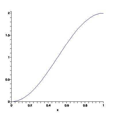
Overall, you are travelling at a rate of 2 miles per hour. That is, in one hour, you managed travel 2 miles. However, if you were to look down at your speedometer at any random time, it might not read 2 miles per hour. There are times that you went faster, and times that you went slower.
For instance, when \(x=0.5\), what is the slope of that curve? That is, at the half hour mark, how fast are you travelling? what is your rate of speed? In algebra, we learn to calculate slope by computing rise over run. That is, pick two points on the line, and divide the vertical distance by the horizontal distance. Starting at the half hour mark, we would measure the slope be calculating how far up and how far over we go from that point. Unfortunately, this can give different results.
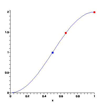
We are going to start by trying to measure slope from the blue point to the red point at the end of the graph. The coordinates of the blue point seem to be (0.5,1), and the coordinates of the red point are (1,2). The slope of the line is then \({2-1\over 1-0.5} = {1\over 0.5} = 2\). That is, at the blue point, you are travelling 2 miles per hour.
Now we are going to try measuring the slope from the blue point to the second red point. The coordinates of the second point are about (0.67,1.5). So we calculate the slope as \({1.5-1\over 0.67-0.5} = {0.5\over 0.17} = 2.9\), which is almost 3 miles per hour!
Depending on where we pick our second point, the value that we calculate for slope will be different. The following table gives some values for the slope of the line at the blue point, calculated using various other points:2One could read these points off of the graph. However, I happen to know what function that graph represents, so I have used other means to calculate exact values. If you are interested in trying it out for yourself, the graph is given by \(cos(\pi x+\pi)+1\).
| Point | Calculated Speed |
|---|---|
| (1,2) | 2 mph |
| (0.67,1.5) | 3 mph |
| (0.6,1.3) | 3.01 mph |
| (0.55,1.16) | 3.12 mph |
| (0.51,1.03) | 3.14 mph |
It turns out that as we calculate speed using points that are closer and closer to the blue point, we get numbers that get closer and closer to the speed that you are travelling at that exact point. This number, called the instantaneous velocity or instantaneous slope, is the speed that you would see on your speedometer if you happened to look down at that exact instant.
If you were to perform these calculations at every instant, you could get your instantaneous velocity for every second of the journey, and you could graph that on a coordinate axis. The result would look like this:
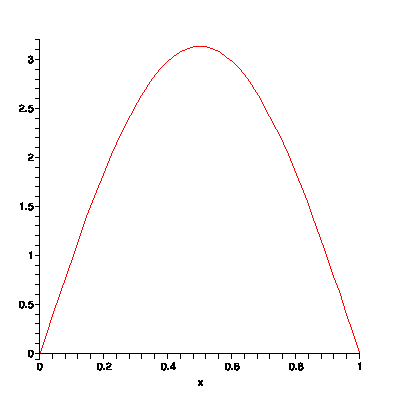
This graph can be thought of in a couple of different ways. The most obvious interpretation is that it represents how fast you are going at any given time. Alternatively, this graph could be thought of as representing the rate at which your distance from home is changing. The rate of change is greatest near the center of the graph, where you are moving the fastest, and is much smaller near the ends of the graph, where you are just ambling along.
And this brings us back to spring.3The data for this figure were derived from the sunrise/sunset calculator at timeanddate.com.
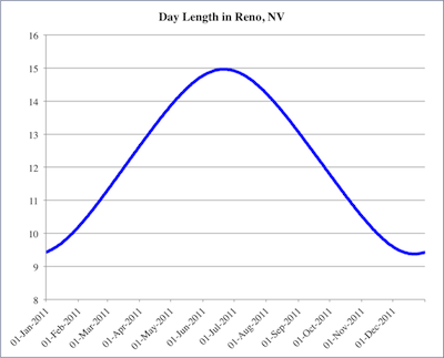
This graph represents how much daylight I am going to get on any given day in 2011. Notice that in January and December, I can expect to get about 9.5 hours light, while in June and July, I might get as much as 15 hours of light. The amount of light that I get on any given day is constantly changing, which means that I can think about the rate at which it is changing. In the summer, near the top of the graph, the amount of daylight I get might vary from day to day by just a few minutes or seconds—during the summer months, the instantaneous slope of the graph is quite small.
On the other hand, the steepest parts of the graph happen to occur at the equinoxes (the vernal equinox today, and the autumnal equinox in September). This means that on those days, the amount of light I get is changing the fastest. In other words, the different in the length of daylight today and tomorrow is going to be greater than between any other days of the year (more or less).
The point of this vernal digression: calculus may seem like a difficult or arcane subject, but it comes down to a fairly simple idea. In the end, calculus is the study of how quickly things change. Forget the crazy notation. At the end of the day, calculus answers a couple of basic questions: how fast am I going and how quickly is my speed changing?